Essay 2
Between deployment and data
Why is writing business software so hard? Essay two.
When I was a senior person on a software project, I was often responsible for helping new people understand the system, and I would usually do that at a whiteboard. I would start with one box, explain what it was, add another, explain the relationship, and gradually build up the picture while the other person asked questions. The drawing was part of the explanation. If I had explained something badly I could rub it out; if we discovered we were using a word differently, that surfaced while the picture was still half-finished. Later, when I had to onboard people remotely, I reproduced a version of the same approach with PowerPoint animations, progressively revealing boxes and relationships. It helped, but it was never as good, because the picture was already decided before the conversation started.
The two pictures I most often built were a deployment diagram and parts of the entity model. Both went into Confluence afterwards so people could refer back to them. Occasionally I also drew something closer to a collaboration diagram, numbering the lines between larger components to show the order in which they interacted, although it was never really a formal UML collaboration diagram. Those drawings were normally made for one conversation and then disappeared.
Looking back, that distinction interests me. I had durable ways of representing where the software ran and what data it remembered, and only temporary ways of sketching how the software behaved between those two views.
The two surviving views
The deployment view is usually straightforward. There is a browser, an application, a database, perhaps a message broker and several external systems. The drawing may contain three boxes or thirty, but it has a vocabulary people understand and a purpose that is easy to explain.
The data is also drawable. Tables, entities, keys and relationships give us a stable way to talk about what the system remembers. Even after decades of object-oriented design, an engineer trying to understand an unfamiliar business system will often end up drawing the data.
It is worth being precise about why that works. The useful property is not necessarily that the whole data model is small. Real enterprise schemas can contain thousands of tables. The useful property is that you can draw the six tables relevant to the conversation and still have a truthful picture. Account, payment, ledger entry and the relationships between them can be a genuine subset of the data model. The tables you leave out do not usually change what those six mean.
Try to do the same thing with application code and the ground gives way.
Why the code view stopped helping
A colleague of mine once tried to generate a class diagram from a large system — not the one in the previous essay — using Graphviz. For a while he thought Graphviz had stopped responding. Eventually it did finish, and the problem turned out not to be the tool but the answer. The system contained around four thousand classes, and the resulting diagram was so dense that it was effectively unreadable. The software had produced a faithful picture, but not one a person could use.
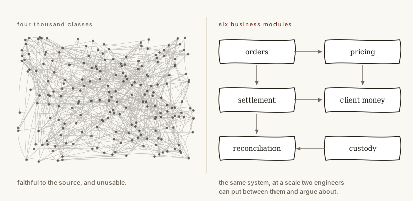
There is a further complication in modern code. In a system built heavily around dependency injection, the static relationships are not necessarily the relationships that make up the running program. A class depends on an interface, an implementation implements that interface, and the fact that those two are connected may live in container configuration, annotations, scanning or framework convention. Extend the system across a network boundary and the connection may not be in the codebase at all. A more sophisticated tool can reconstruct some of this, but at that point it is no longer just drawing the source. It is reverse-engineering the application.
So a generated class diagram can be both enormous and incomplete. It can contain thousands of boxes while some of the relationships you most want to understand are another level of indirection away. Nor can you rescue it in the way you can rescue a large entity model by selecting six interesting classes. Six tables can be a meaningful subset of a schema. Six classes chosen from four thousand are usually just fragments of an implementation whose meaning depends on things you have omitted.
Sequence diagrams and collaboration diagrams do not really solve that problem at class level. I have always found sequence diagrams awkward at a whiteboard, while collaboration-style diagrams are easier for me because I can draw the relevant things and number the interactions between them. But either notation becomes fragile when the units are individual implementation classes: insert another collaborator, extract a helper, change the call structure and the picture is immediately suspect.
Packages as the missing level
This is where the conclusion from Fifteen hundred classes and no visible shape matters. If every class is treated as an architectural unit, the design has roughly the same cardinality as the class graph. If the package is treated as the module instead, the picture changes.
A system with fifteen hundred classes might have a dozen meaningful packages representing things such as orders, pricing, settlement, client money and reconciliation. The classes inside those packages still matter, but they no longer all need to appear in the architectural view.
At that level the old diagrams become useful again. A collaboration diagram of eight business modules can fit on a whiteboard. A sequence diagram at that level can be short enough to argue about. You can point at a dependency and ask why settlement needs to know about pricing, or why reconciliation can call directly into client money.
The notation was not necessarily the problem. We had been asking it to operate at a cardinality no person could use.
This also helps explain durability. Class names and call paths change constantly. Business modules chosen around responsibilities and decisions should change much less often. If a module called settlement survives several internal refactorings, then a module-level drawing can survive them too.
That is a much more useful middle layer than either a thousand-class diagram or a list of technical layers such as controllers, services and repositories. It tells us what the program is made of at a scale two engineers can actually discuss.
Artefacts for conversation
The point is not that we need more documentation. A diagram sitting in Confluence is not automatically valuable, however accurate it was when somebody created it. The important thing is the communication that happens around a shared representation.
Starting with an empty whiteboard worked because the picture and the conversation developed together. I could introduce one concept, answer a question, discover that we were using a word differently, redraw a boundary or add something I had forgotten. The finished picture was useful afterwards, but in some ways it was a by-product of building a common understanding.
We still need common artefacts because the conversation needs something to happen around. Without them, several people can discuss the same design while carrying slightly different models in their heads. Put a module map between them and they can discuss whether the main parts of the application are right, whether a dependency is justified, whether a boundary is in the right place, and whether one part knows too much about another.
This is also why source code is not enough. The code may be authoritative about what the program currently does, but it contains far more detail than most design questions require. A useful design artefact deliberately leaves things out. It exposes the things the discussion is about and hides the things that would only distract from it.
What I would draw now
For the kind of business systems I have spent most of my career working on, I would now expect three structural views.
The deployment view tells us where the software runs and which systems are outside our control. The data model tells us what persistent state the business records. Between them I would put a module view: a small number of business-oriented packages or equivalent modules, with their important dependencies and collaborations.
I do not think that requires a new modelling language. A simple package diagram may be enough. A collaboration diagram may be useful when several modules participate in an operation. A sequence diagram may work when it is drawn at that level rather than across hundreds of classes.
The important thing is not the notation. It is that the representation remains human-scale, stable enough to survive ordinary refactoring, and simple enough that two engineers can put it between them and have a useful discussion.
A practical test
Take a system you know well and imagine onboarding somebody to it at a whiteboard. Start with an empty board.
Draw the deployment view and the relevant part of the data model. Then try to name the main parts of the program without using framework layers. If the only honest answer is hundreds or thousands of classes, move up a level and ask whether there are a handful of meaningful modules instead.
Draw those modules and the important relationships between them. Can another engineer point at the picture and ask why one module depends on another? Can you change the internals of a package without invalidating the diagram? Can you explain the overall shape of the program without opening the source code?
If you can, one part of the missing middle may not have needed a new notation at all. It may have needed us to start drawing the program at the right level.
What this leaves out
But that only recovers a structural view. A module map can tell us what the software is made of, which parts collaborate and where important dependencies cross a boundary. For a business system, there is another question which it does not answer: what changes together when the business moves from one valid state to another?
That question takes us back to the entity model, not because the code above it is unimportant, but because the persistent facts are often the most durable part of the system. Once we start asking how those facts are allowed to change, a different missing design artefact appears. That is where the next essay begins.